
How to Hang Art Tastefully in Your Home
Art changes the personality of a room.
It can pull a space together, soften hard edges, or give your eye somewhere to land after taking in the bigger picture. That said, placement is where the magic happens. The same piece can feel striking or completely misplaced depending on where and how you hang art.
Our team sees it all the time. Beautiful artwork ends up floating too high, squeezed into the wrong scale, or scattered without purpose. Learning how to hang art is less about rules and more about reading the room. Pay attention to proportion, sightlines, eye level, and how people move through the space. When those pieces fall into place, the art starts working with the room instead of competing against it.

“Art transforms interiors through placement, proportion, composition, and architectural relationship.”
— Trevor Fulmer
Understanding scale & proportion
Scale is the first decision that sets everything else up. If the size is off, no amount of careful measuring will fix it later.
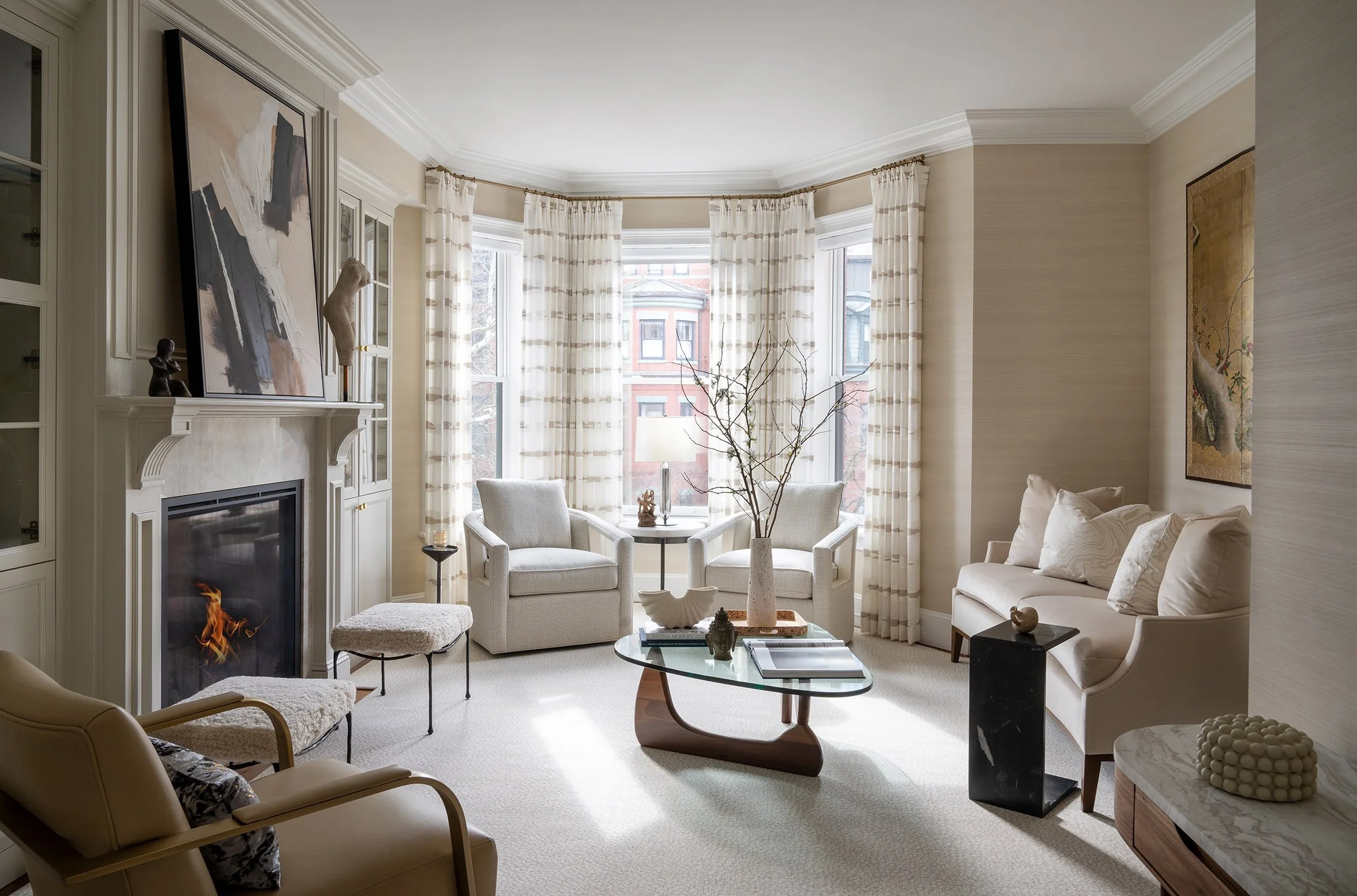
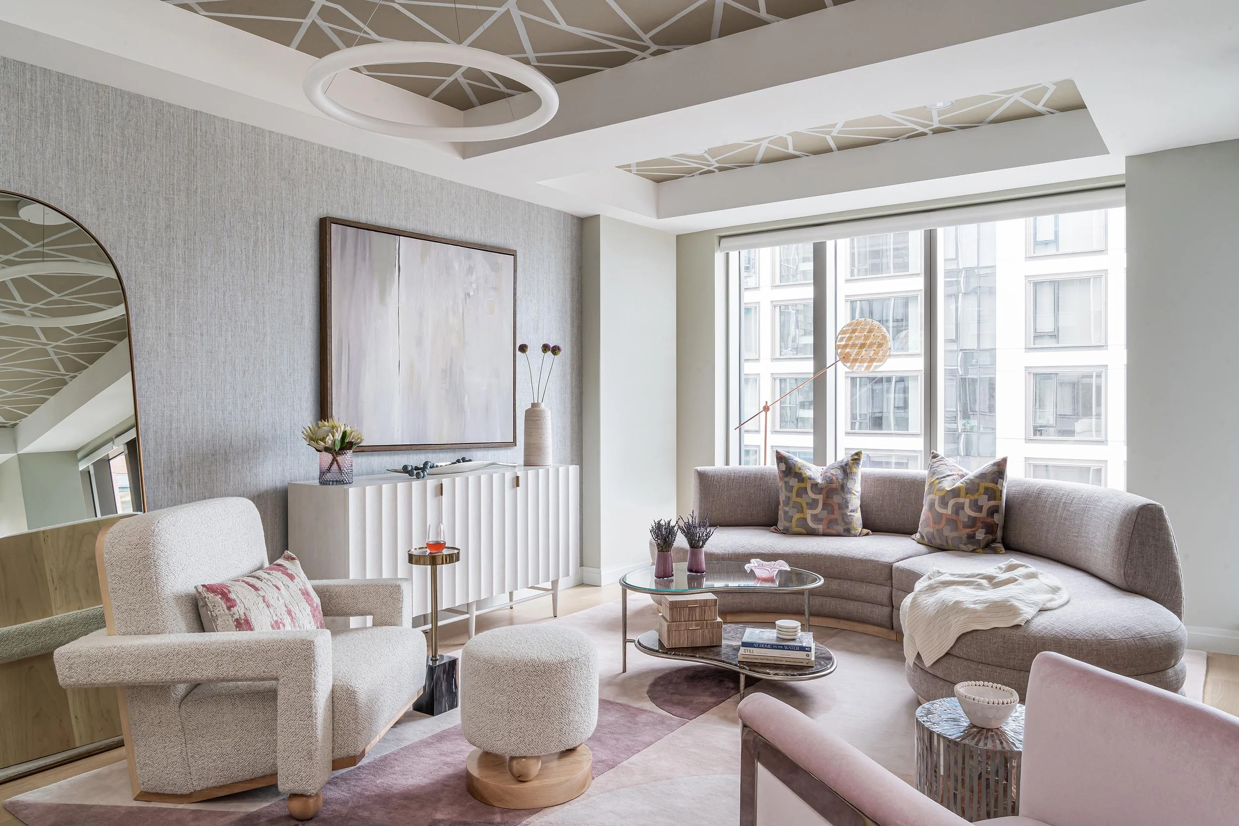
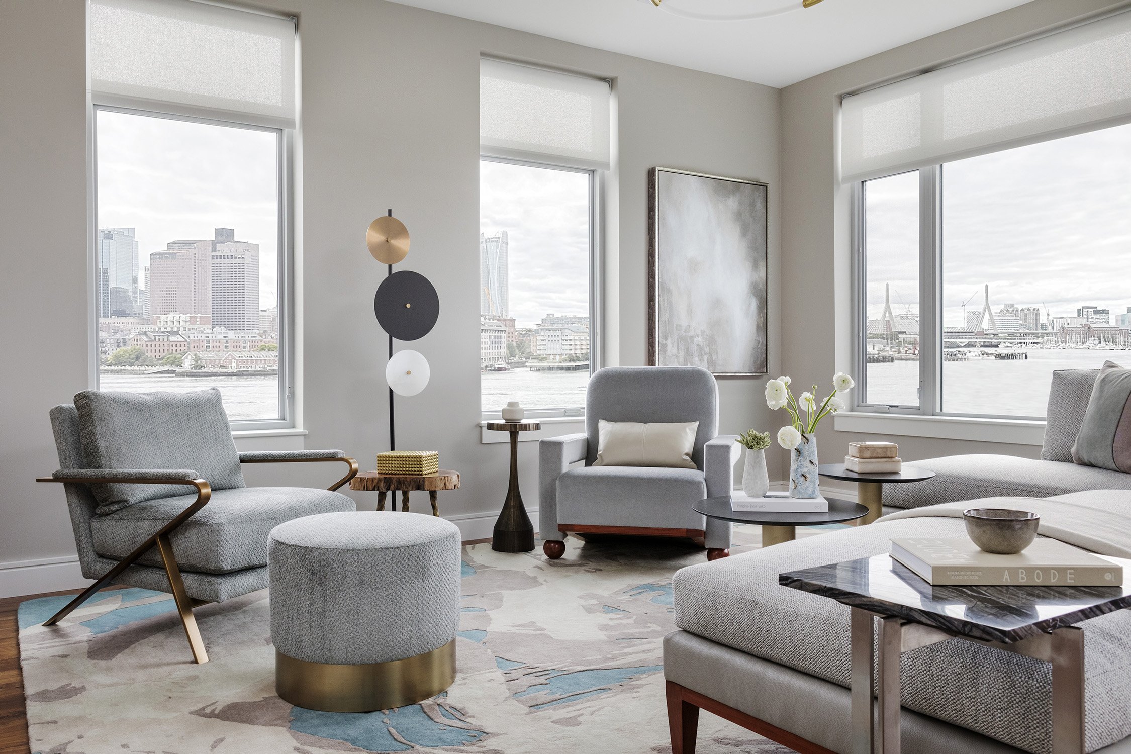
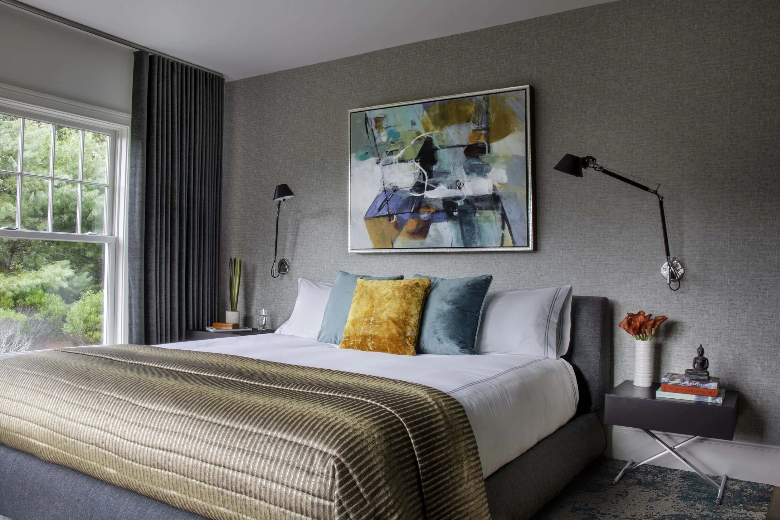
When you hang wall art above furniture, the goal is to create a connection. Artwork should typically span about two-thirds the width of the piece below it. Above a sofa, that means your art should feel wide enough to hold its own against the length of the seating. The same applies over beds, consoles, and mantels.
If you’re working with smaller pieces, group them so they read as one. When you hang pictures in a cluster, think of them as a single unit rather than separate items. The overall shape matters more than each individual frame.
Large walls call for bold decisions. One oversized piece can often feel more natural than several smaller pieces spaced too far apart. It fills the wall without looking hesitant.
If something feels off, step back and squint a little. If the artwork looks like it is drifting or shrinking into the wall, the scale likely needs adjusting.
The ideal hanging height
This is where most people get tripped up. They go too high almost every time. Ideally, the center of your artwork should land around 57 to 60 inches from the floor. That puts it at a comfortable viewing height while also keeping the room grounded.
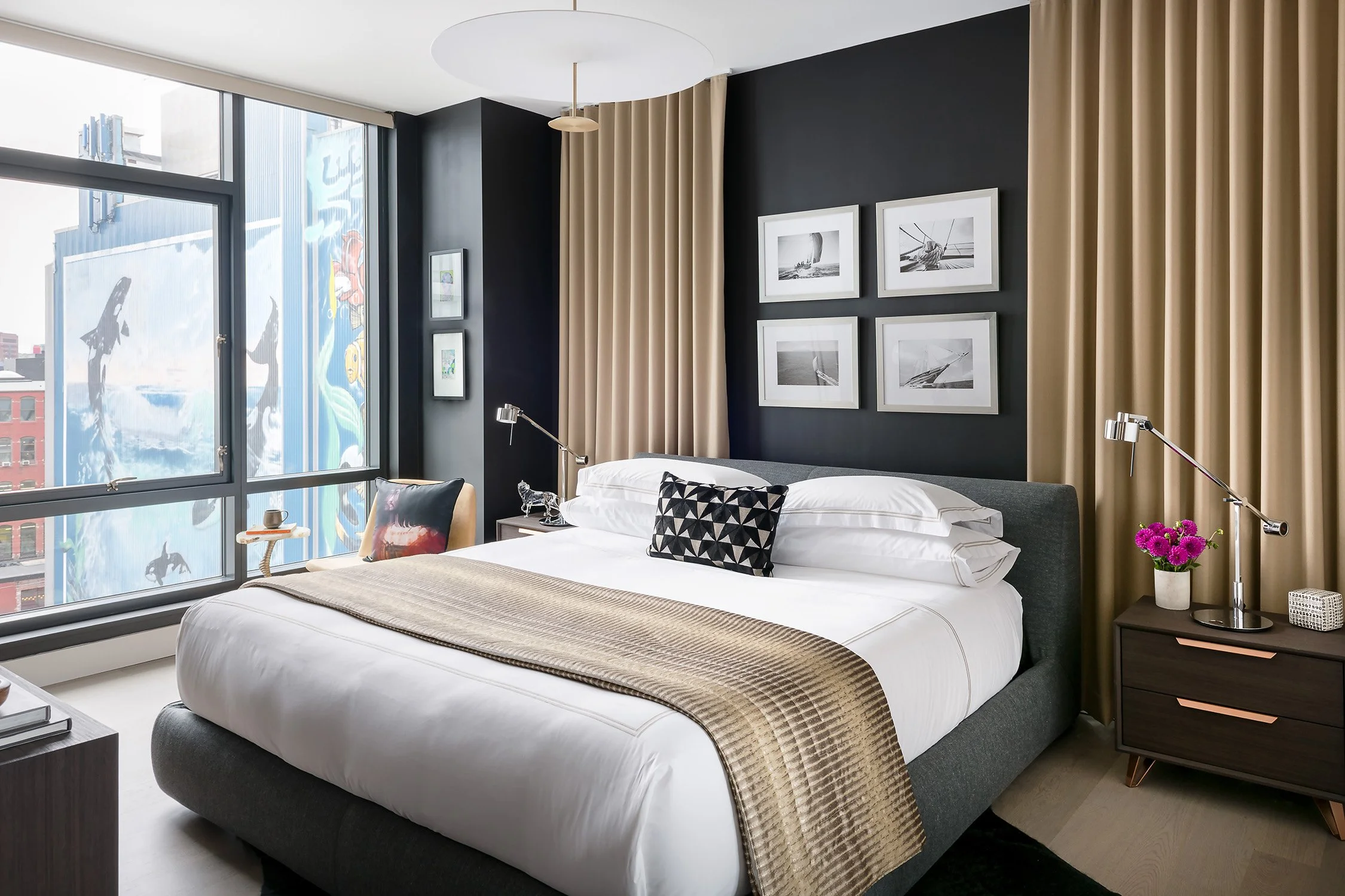
When hanging artwork above furniture, adjust from there. The bottom of the frame should sit about six to eight inches above the back of a sofa or headboard. Close enough to feel connected, but not so low that it feels crowded.
Higher ceilings do not mean higher art. It is tempting, but it rarely works. Keep the art tied to the human scale instead of chasing the ceiling.
In staircases or long hallways, you can follow the line of movement. Let the artwork step up with the stairs or maintain even spacing along the wall. Imagine a steady rhythm as you move through the space.
Before you make a single nail hole in the wall, measure carefully and double check your numbers. Any guesswork shows immediately when hanging artwork.
Grouping artwork & gallery walls
Gallery walls look effortless when done right, but they are rarely spontaneous. A little planning goes a long way.
Start by deciding on a structure. A grid feels orderly and works well when pieces are similar in size. A cluster feels more relaxed and collected over time, with variation in shape and orientation.
Spacing is what keeps a gallery wall from falling apart. Aim for about two to three inches between frames. Consistency matters more than the exact number.
Before you hang artwork, map it out. Lay the pieces on the floor or use paper templates taped to the wall. This lets you adjust spacing and placement without committing too early.
When hanging artwork in a group, treat the entire arrangement as one piece. Find the center point of that grouping and align it using the same height rules you would for a single frame.
When mixing, you want to avoid creating visual chaos. Our tip is to look for a common thread. It could be a color, a material, or even a mood. Remember, mixing works best when there is something tying it together.

Aligning with furniture & architectural elements
Art should feel anchored to something. Floating artwork is one of the quickest ways to make a room feel unsettled.
Above a sofa or console, center the artwork so it lines up with the furniture below. Let the edges relate to one another. This creates a quiet sense of order.
In a bedroom, artwork should connect to the bed. In a dining room, it might align with the table or the light fixture above. These relationships help the room feel considered without trying too hard.
Architectural elements also offer guidance. Windows, doorways, and built-ins create natural boundaries. If you have a niche, treat it like a frame within the wall and hang artwork to fit that space.
When we approach living room design, we make sure to anchor art to key focal points in the room and plan art placement alongside furniture. It’s much easier to get it right when everything is considered together, rather than as added-in pieces later.
Balancing color, frame, and style
Mixing styles can bring depth to a space, but it needs a steady hand.
Begin by finding a thread that connects your pieces. It might be a repeated color, a similar tone, or a shared subject. That thread keeps the mix from feeling random.
Frame styles do not need to match, but they should relate. A mix of black, wood, and metal can work well when balanced. Too many unrelated finishes can feel scattered.
Matting is another tool worth using. A wider mat can give smaller artwork more presence and help it hold its own on the wall.
When choosing artwork, look at the room first. Pull colors from rugs, upholstery, or other elements already in place. The goal is to make the art feel like part of the space rather than something dropped in.
After all, a little contrast keeps things interesting, while too much contrast feels disconnected.
Practical installation tips & tools
Once you have your layout, the installation should be straightforward. The right tools make all the difference.
Use a level every time. Even a slight tilt is noticeable once you step back. Mark your measurements carefully before placing hooks.
Drywall can support lighter pieces with standard hanging hardware, but heavier pieces need wall anchors or to be mounted into studs. Plaster walls require more care and the right approach. If you are hanging something substantial, you should use two hooks to prevent shifting over time.
Lighting can also change how artwork reads. A picture light or a well-placed ceiling light can highlight texture, color, and detail.
If the process feels uncertain, it is worth bringing in professionals. Our experienced interior designers can handle placement and installation so everything lands exactly where it should.
Common mistakes to avoid
The most common mistake is hanging art too high. Lowering it often fixes the problem immediately.
Another is choosing artwork that is too small for the wall. It leaves too much empty wall space and makes the room feel unfinished. Either go larger or group multiple pieces together. Inconsistent spacing in gallery walls can throw off the entire arrangement. Keep your gaps even.
Ignoring alignment is another issue. Artwork that is slightly off center from furniture or architectural lines creates a subtle imbalance that is easy to feel. Rushing the process leads to extra holes and second guesses. Take the time to plan before you hang artwork.
Hang it once, get it right
When you hang art purposefully, the room settles into place. It feels more complete, more comfortable, and easier to move through.
Keep this checklist nearby next time you are hanging artwork:
Check scale against furniture and wall size
Center artwork around 57 to 60 inches from the floor
Keep spacing between frames at two to three inches
Align art with furniture and architectural lines
Mix frames and styles with a clear connection
Use proper tools and anchors for your wall type
Measure 10 times before placing nails
Good placement is what turns artwork into part of the room rather than decoration on top of it.