
How to Fill an Empty Wall
Blank walls are missed opportunities
A blank wall has a way of undermining a room. You can have the right sofa, a well-scaled rug, layered lighting, and thoughtful furniture placement, yet the space still feels unfinished. That lingering sense that something is off often traces back to the wall. When left untouched, it can create imbalance. It draws attention precisely because nothing is happening there.
When clients ask us how to fill an empty wall, they are usually responding to that subtle lack of direction. The room may function well, but visually it feels incomplete. The eye moves through the space and never quite settles. Walls do more than hold art. They frame furniture, establish proportion, and shape how a room is experienced from the moment you enter. When they are ignored, the entire design feels unresolved.
At Trevor Fulmer Design, we approach walls as integral parts of the architecture, not leftover surfaces waiting for decoration. The right treatment can ground a seating area, introduce storage, adjust scale, or create a focal point that gives everything else context. A blank wall is not an empty problem. It is an opportunity to bring structure into the room.
Blog Contributor:
Trevor Fulmer

“Thoughtful wall treatments bring balance, structure, and presence into interiors.”
— Trevor Fulmer

Start with scale & proportion
Before choosing artwork or planning built ins, you’ll want to step back and study the wall within its environment. Notice the ceiling height, the width of the wall, and what sits beneath it. A wide sectional creates different demands than a narrow console table. A room with generous ceiling height requires a different visual strategy than one with standard proportions.
Most missteps happen because scale is overlooked. A small piece of art centered on a large wall feels tentative. A narrow grouping above a substantial sofa looks disconnected. Even beautiful pieces fail when they are undersized in relation to the room.
Testing size before committing often saves you time as well as regret. A great way to visualize it to tape paper templates to the wall that reflect the dimensions you are considering. Let them stay up for a few days so you view them from different angles and distances. This simple method can help you better understand whether the scale feels balanced or lacking.
As a general guideline, artwork or a composition above furniture should span roughly two thirds to three quarters of the width below it. This creates a visual relationship that feels intentional rather than accidental. In taller rooms, larger pieces or vertical elements can draw the eye upward. In more compact spaces, tighter compositions prevent the wall from dominating.
When proportion is handled correctly, everything else becomes easier.
Gallery walls – art & photos
A gallery wall can introduce personality and depth, but it only works when there is structure behind it. Without planning, it risks feeling scattered.
Begin by defining a direction. A collection of black and white photographs immediately establishes unity. Prints that share a common palette feel curated even if the subject matter varies. The goal is not uniformity, but connection. Every piece should feel related in some way.
Frame selection plays a significant role in that connection. Mixing sizes adds interest, yet limiting finishes keeps the overall arrangement disciplined. Lay the entire composition out on the floor before you hang anything. Start with the largest piece and build outward, maintaining consistent spacing between frames. Two to three inches typically keeps the layout cohesive without crowding.
When transferring the arrangement to the wall, position the center of the composition at eye level. If the gallery sits above a sofa or console, lower it enough so it visually anchors to the furniture. The grouping should feel integrated into the room and should not hover above it.
A gallery wall is a strong solution when you want layered interest and the flexibility to expand over time. It tells a story while maintaining visual order.
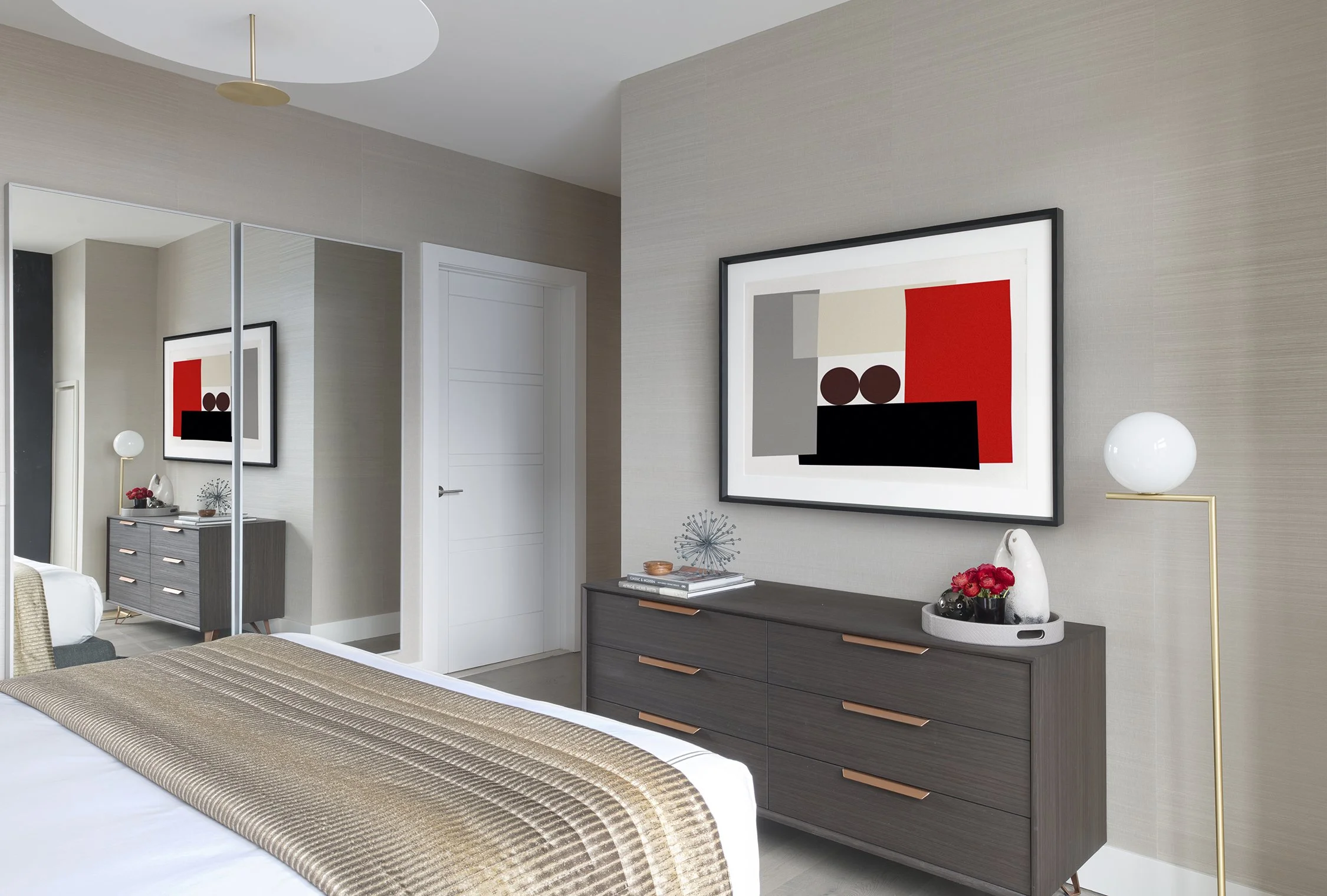
Statement art or oversized pieces
There are moments when restraint carries more impact than complexity. A single oversized statement piece can anchor a wall while eliminating visual noise. This approach works best on broad, uninterrupted surfaces. Placed behind a sofa, above a bed, or centered in a dining room, a large painting or photograph establishes focus immediately. The key is choosing a piece with enough presence to relate to the scale of the furniture beneath it.
Color should connect to the room without competing. Consider pulling tones from existing textiles or finishes so that the artwork feels deliberate within the palette. In neutral interiors, bold pieces can introduce depth and contrast. In rooms with existing pattern, quieter artwork with texture may provide balance.
Statement pieces are not limited to canvas. Textile art, sculptural installations, or framed panels can create similar impact through material and scale. When done thoughtfully, one decisive element often works more effectively than a collection of smaller pieces.

Shelving & built ins for function and presence
Walls can serve a practical purpose while strengthening the design and shelving is a great way to introduce depth and utility without sacrificing style.
Floating shelves allow for layered arrangements of books, ceramics, framed art, and collected objects but the arrangement matters. Leaving negative space between items gives each piece importance. Varying heights and grouping objects thoughtfully prevents the display from feeling crowded.
Built ins take this concept further by integrating storage into the architecture. Floor to ceiling shelving around a fireplace, a media wall with concealed cabinets, or a window seat framed by cabinetry adds structure and permanence. These features shift the room from basic to tailored, giving the wall a defined role in daily life.
When designing shelving, be sure to balance open display with restraint as not every inch needs to be filled. A curated arrangement with breathing room feels focused.
Mirrors to expand light & space
Mirrors change the perception of a room without adding bulk. They reflect light, extend sightlines, and introduce dimension.
Positioning a mirror across from a window increases natural brightness, which makes the space feel more open. In narrow hallways, it can visually widen the passage and in dining rooms, it reflects light fixtures and adds depth during evening gatherings.
Scale remains critical. A mirror should feel substantial within the wall’s proportions. Larger mirrors with clean frames often create stronger presence than small decorative pieces. Leaning a tall mirror in a bedroom can introduce height while maintaining a relaxed atmosphere.
What the mirror reflects matters just as much as the mirror itself. It should capture something worth repeating, whether that is a view, artwork, or a styled console.

Textural wall treatments wood wainscoting panels
When art feels temporary, architectural texture offers a lasting alternative. Millwork, wainscoting, and paneling introduce depth that flat drywall cannot provide.
Vertical slats emphasize ceiling height. Box molding adds structure and refinement without heaviness. Wood paneling introduces warmth and character. These treatments shape the room throughout the day as light moves across their surfaces.
They work especially well in dining rooms, offices, and bedrooms where you want the walls to feel established. In entryways, paneling can set a strong tone before furniture even comes into view.
Proportion still guides the outcome. Taller ceilings support larger panel divisions, while standard heights benefit from balanced spacing. Once installed, these surfaces often require minimal additional decoration because the texture itself carries visual interest.

Accent paint or wallpaper
Color can define a wall in one decisive move. A painted accent wall grounds a seating area or highlights architectural features without adding physical layers.
Selecting the right tone begins with the existing palette. Drawing from upholstery, rugs, or artwork maintains connection throughout the room. Darker hues can anchor expansive walls, while rich mid tones add depth without heaviness.
Wallpaper introduces pattern and movement. Large scale designs suit uninterrupted walls, while smaller patterns work well in intimate spaces. Applying wallpaper within built ins or above wainscoting offers a controlled way to introduce pattern without overwhelming the room.
Plants & greenery as wall elements
Greenery introduces softness and life in a way few other elements can. Mounted planters, hanging pots, or vertical gardens add dimension that evolves over time.
In spaces with natural light, trailing plants can break up rigid lines and bring movement to the wall. Structured planters mounted symmetrically can frame artwork or mirrors and create balance.
If maintenance is a concern, high quality faux greenery can still provide texture, however the placement remains key. Plants should relate to nearby furniture or architectural features so that they feel integrated.
Often, greenery acts as the finishing layer. It softens millwork, complements shelving, and warms painted walls without adding clutter.
Make your wall work harder
A blank wall presents a design decision. It can hold one commanding piece or a carefully composed gallery. It can support shelving that serves daily life or architectural paneling that reshapes the room. It can reflect light through a mirror or introduce depth through color and texture.
The process always begins with proportion and intention. Study the wall in context and consider what the room needs most – whether that’s focus, storage, warmth, or light. When every decision is deliberate, the wall becomes an asset rather than an afterthought.
If you’re facing a space that feels incomplete and want guidance, our interior design services approach each surface with purpose. We consider the full environment so that every wall contributes to the whole.
Contact us when you are ready to give that wall direction, and let’s create a room that feels finished from every angle.